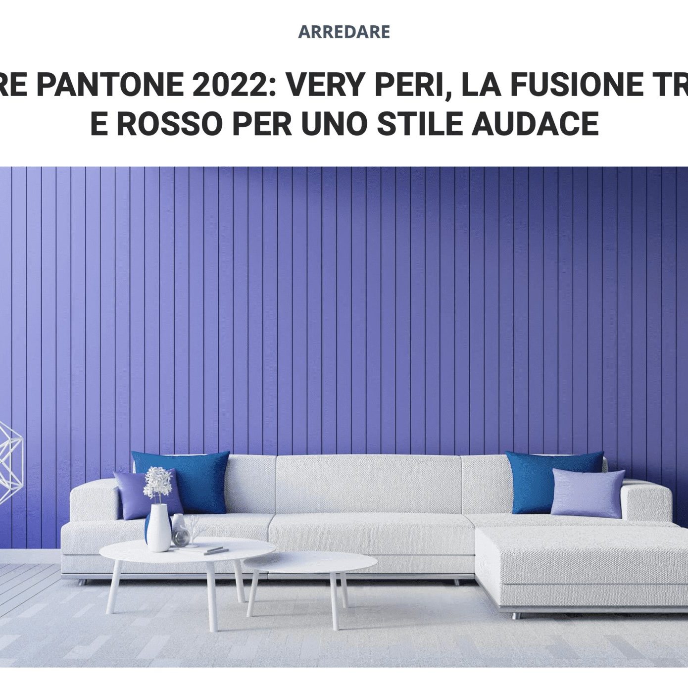
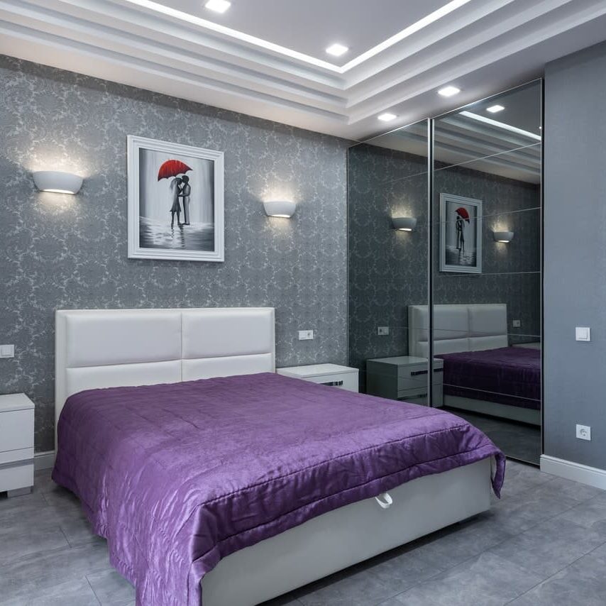
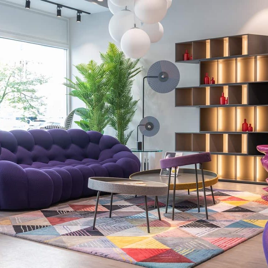
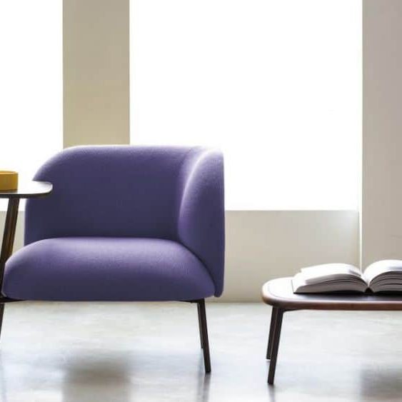
“As we move in a world of unprecedented change, the choice of Very Peri is the ambassador of a new perspective and vision of the beloved and dear blue family. It embraces the qualities of blues but has a purple-red undertone at the same time. Very Peri shows a lively and joyful attitude, a dynamic presence that encourages imaginative expressiveness and a creativity capable of daring.”
Leatrice Eiseman
Executive Director of the Pantone Color Institute
In this first article of the year we deal with one of the most important themes relating to the world of color in the fashion world and in all areas of planning and design: the Pantone color of the year.
First of all, for the less technical who probably do not know this initiative or do not know what Pantone actually is, we must make the following general premise on what the Pantone Color Institute is and what it does.
“Pantone Inc. was founded in 1962 by Lawrence Herbert in Carlstadt, New Jersey, and in 1963 developed the PMS – Pantone Matching System®, a cataloging system that has become international stardard, now a reference point for color management. in industry and chemistry.
A system born from the ingenuity of a part-time employee of M & J Levine Advertising, who uses his knowledge in chemistry to simplify the production of the company’s colored inks, and then buy it and transform it precisely into Pantone Inc., it then became, starting from 2007, the property of X-Rite, the US giant in the production of products for color measurement and management. “
From the site of: https://webcrew.it/pantone/
To date, the colors classified by the Pantone Color Institute are thousands and are classified by use categories. The two Pantone color systems are: Pantone Matching System (PMS) and Pantone Fashion, Home + Interiors (FHI).
Let’s see better in the images below, taken from the Pantone website, which of the two systems is more suitable for the different sectors that make use of the Pantone color classification. And above all because two different color classification systems are needed.
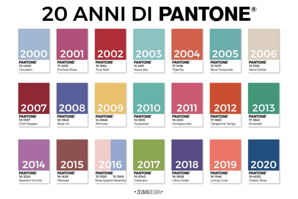
It is from the year 2000 that Pantone decrees, in December, the color chosen for the following year. Given its now fundamental role in the sector, in fact, companies align themselves with the choice and begin to produce objects, fabrics or make-up in the fashion color.
The choice of the pantone color of the year always causes a lot of discussion. See below the pantone colors that followed one another from 2000 to 2020.
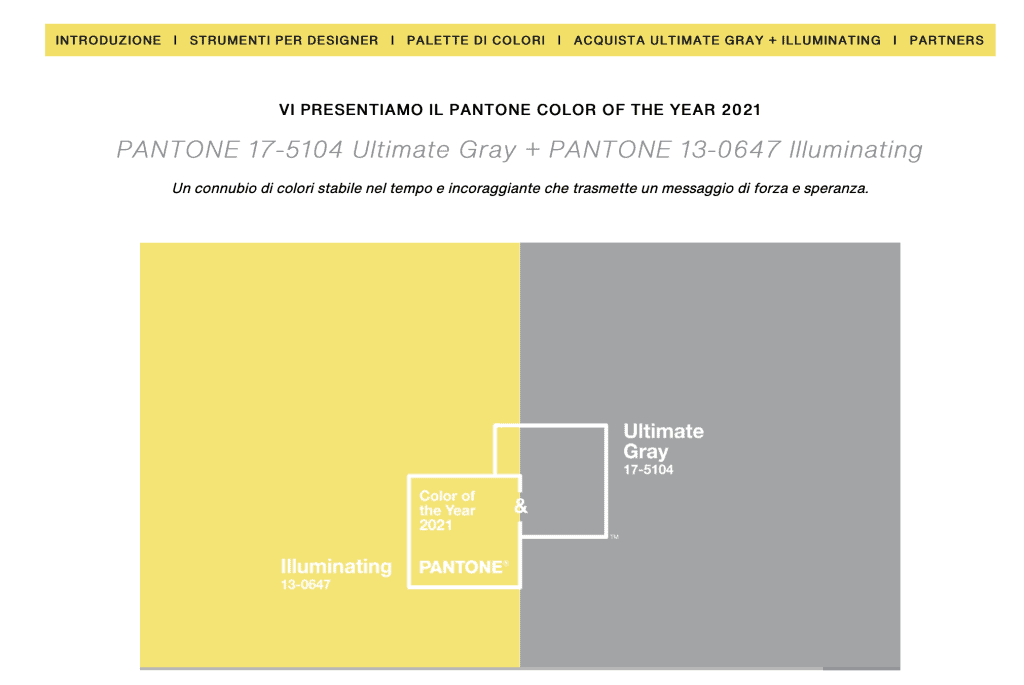
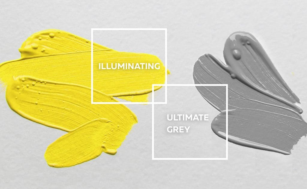
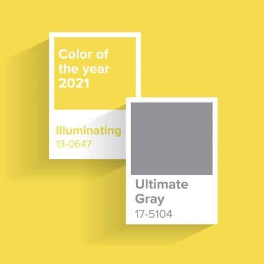
For the year 2021, absent from this table, a combination of two colors was chosen, a tone of gray and one of yellow as a symbol of strength and hope, in this year just concluded of passage and restart after 2020 and all that we know well what happened.
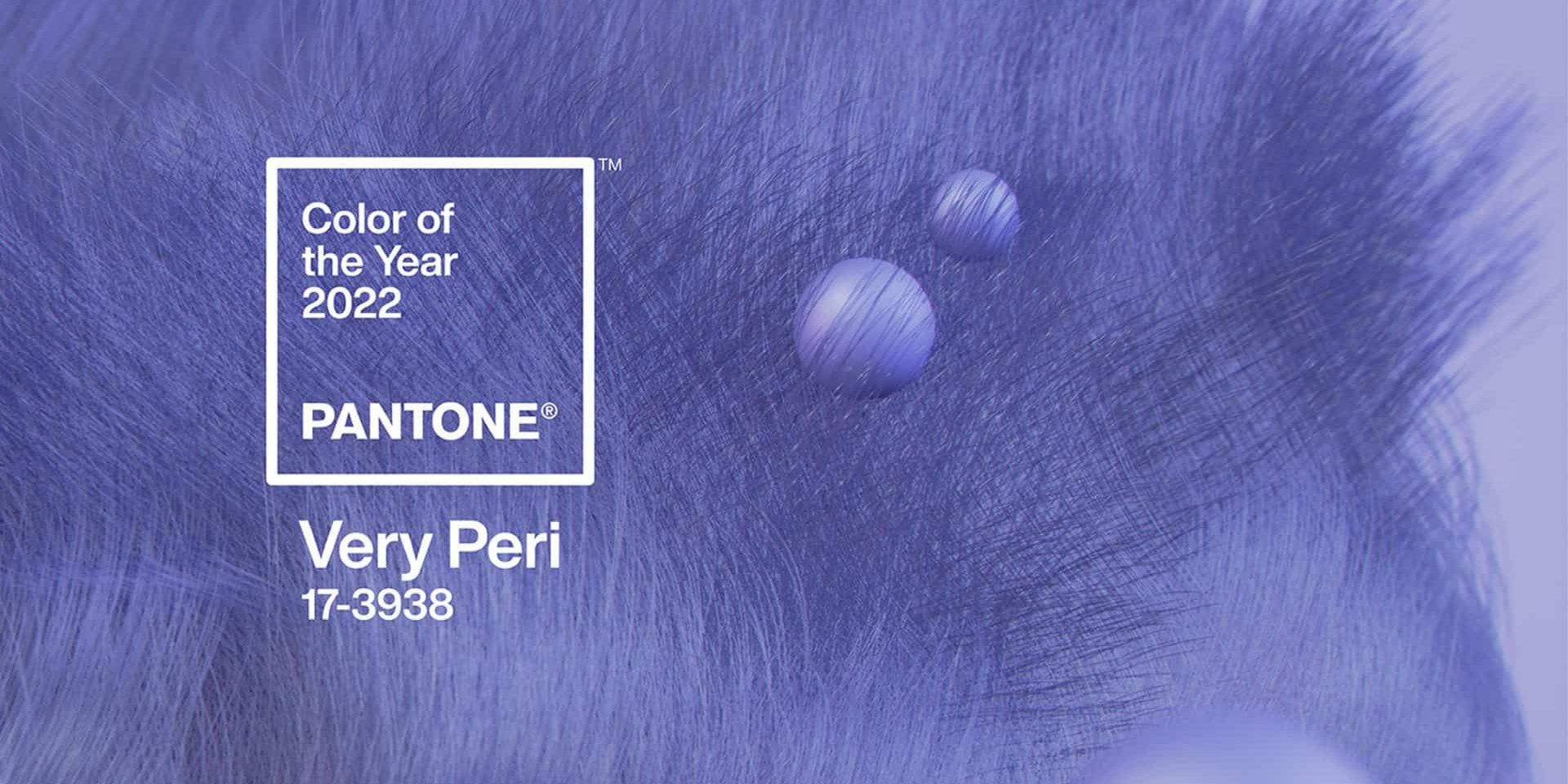
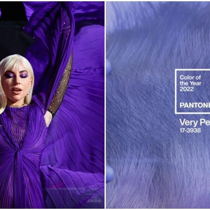
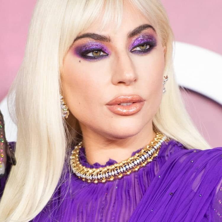
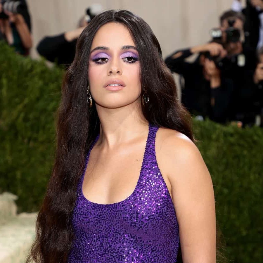
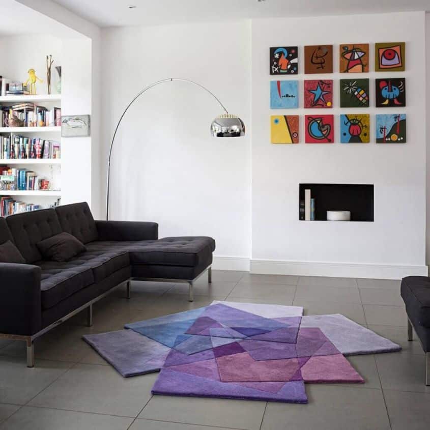
The color chosen for the year 2022 is called Very Peri and corresponds to the color PANTONE 17-3938. It is a real new pantone color, a shade of purple that inspires inventiveness and personal creativity.
As we read in the opening words of this article, from the words of the executive director of the Pantone Color Institute Leatrice Eiseman, “as we move in a world of unprecedented change” the choice of this tone aims to convey a new vision and perspective of the family of tones of blue. Continuing to paraphrase Leatrice, Very Peri, charged with the qualities of blues, has a purple-red “undertone”. It therefore shows vivacity and joy, it is characterized by a dynamism that encourages the imagination, “imaginative expressiveness” and a “creativity capable of daring”.
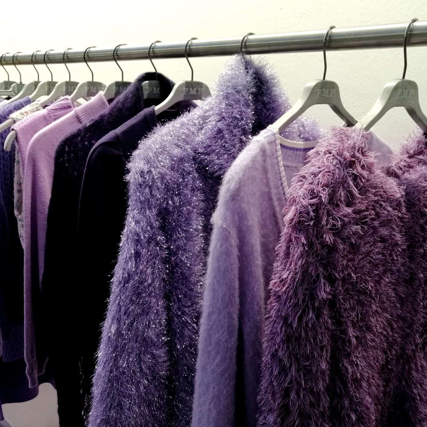
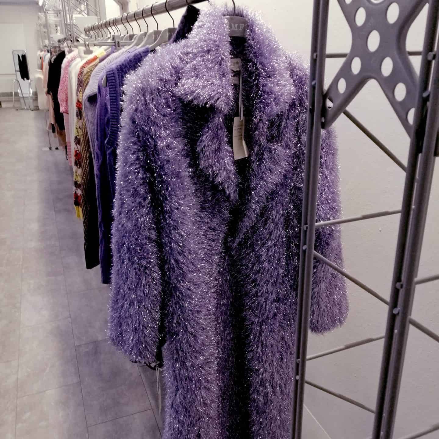
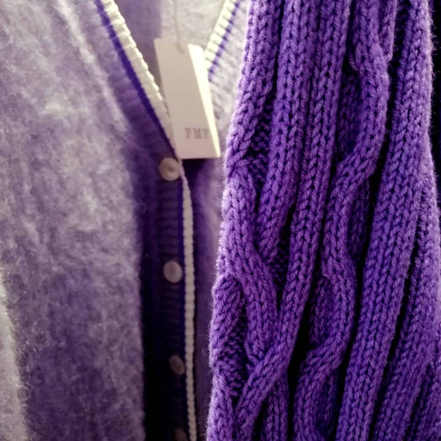
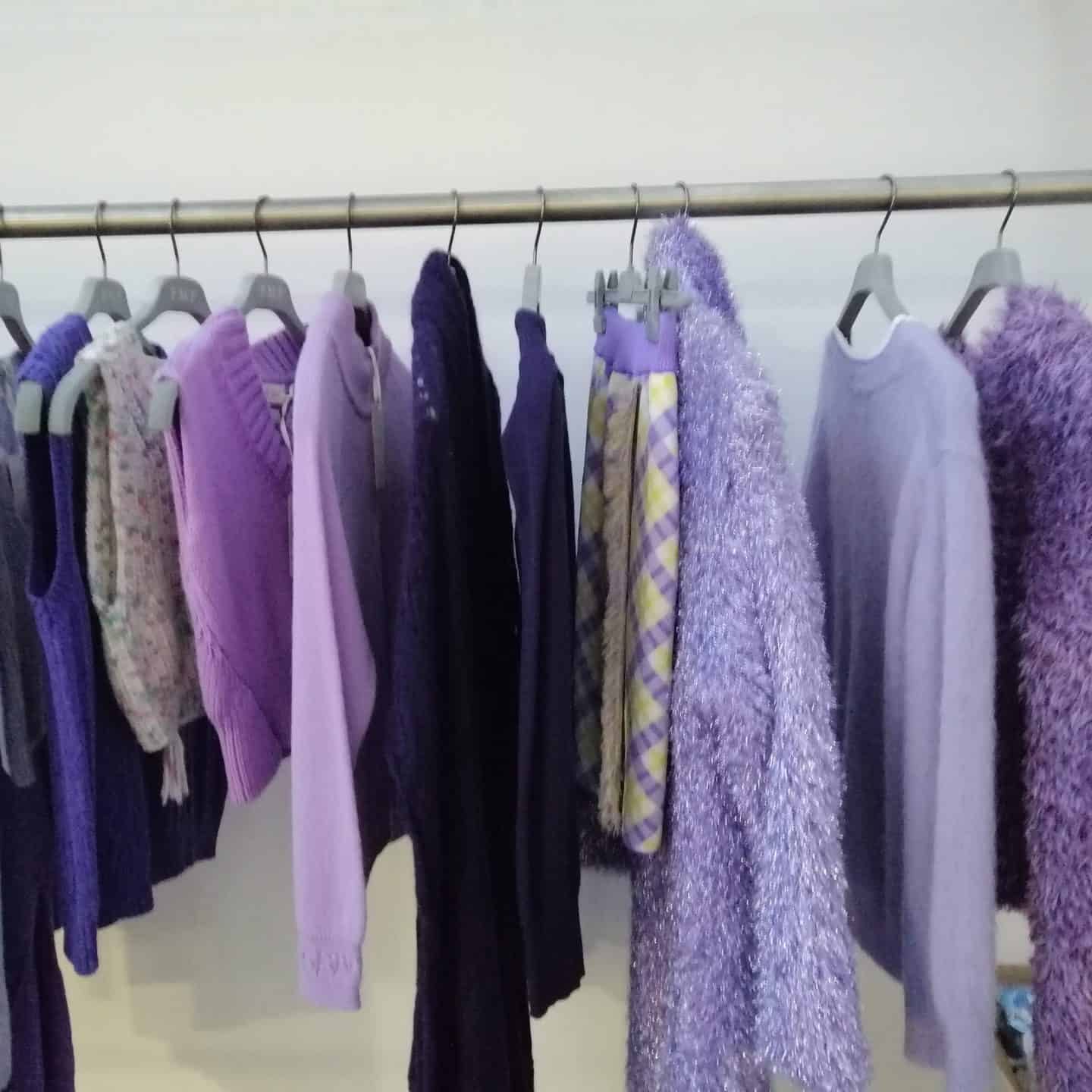
We too, in our own small way, here in the Style Office of the FMF Knitwear Factory, had started the development of our women’s winter samples last year by inserting many shades of purple! Therefore, we too are “forerunners” in a certain sense of this trend that had already been perceived in the air, also thanks to the AW 21-22 fashion shows in June / July last year.
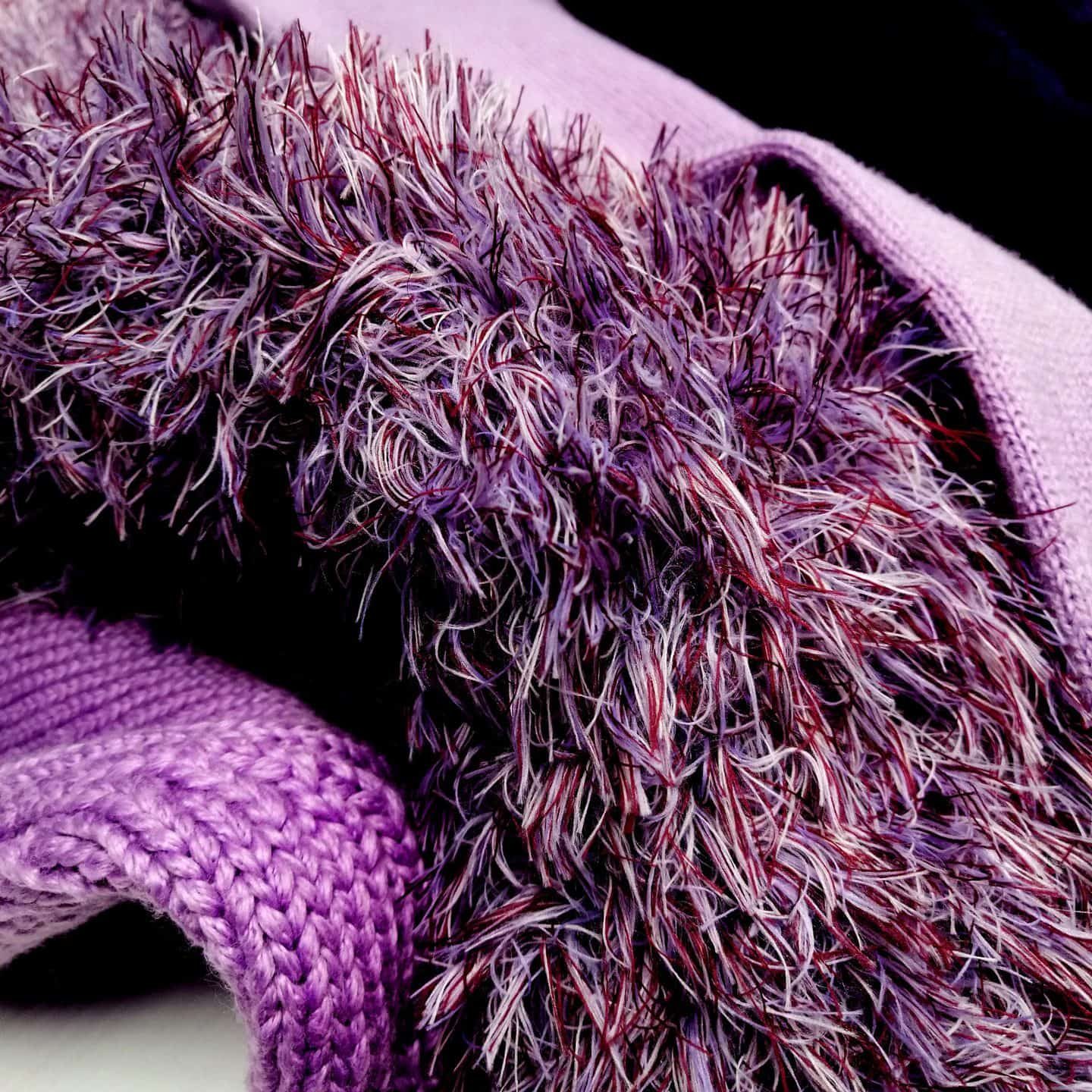
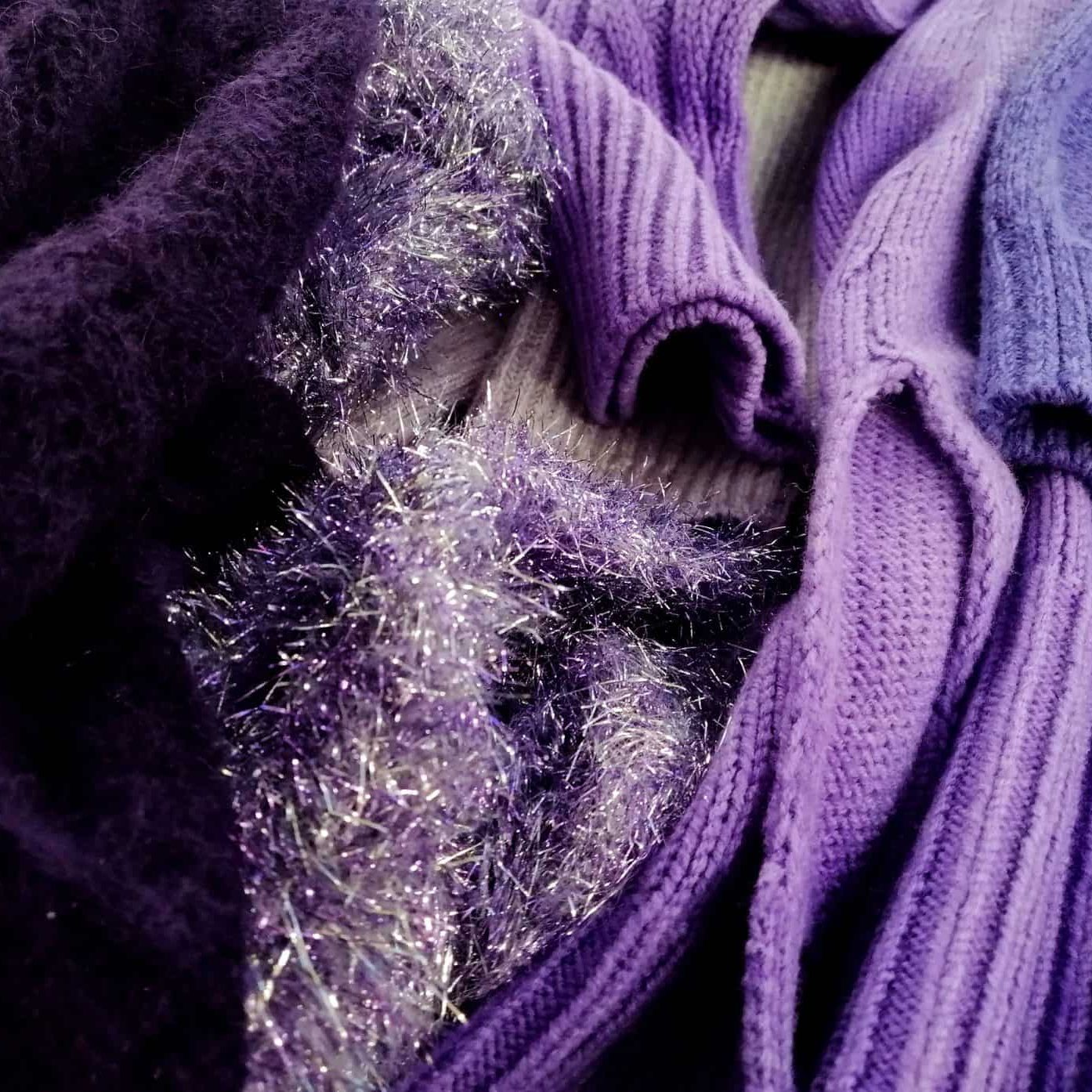
Here are some images of our garments currently on display in our Showroom that include this color in garments with a variety of fits, shapes and styles.

